LANGAGES
![]()
what words can not say
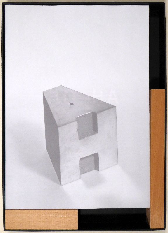
Although we have been designing objects for thousands of years, they are never just 'objects' - as Andrea Branzi will explain much better than I would, in the article dedicated to him - they are not just tools for carrying out everyday tasks. If we can ask why, the question of how is also very interesting. The materiality of an object, its design, its colour... are all clues to the civilisation that designed it. Typography is a very figurative example. In the design of a letter we can read the tone. It has an expressive value that resonates consciously and unconsciously in each of us. It can evoke an emotion; a typeface that follows the codes of handwriting gives a softer and more sensitive aspect. It can also evoke a language, a country or an era. Some typefaces try not to be associated with a period or a style and to be as neutral as possible, such as the grand papesse, Helvetica. Dal cucchiaio alla città, is a reworking of Max Bill's formula by the architect Ernesto Rogers. He talks about the relationship of Italian architects/designers with design: Able to create a spoon, a chair, a lamp and in the same breath, the same day a building. According to him, by observing a spoon very precisely, one could understand the company that designed it and visualise the type of city it would build. This language is therefore in everything around us, the typography of the newspaper we read, the bar chair where we read it, and even the drawn square where this café is set up.
Markus Raetz - Reproduction draw
Ernesto Rogers - Dal cucchiaio alla città